QUOH!
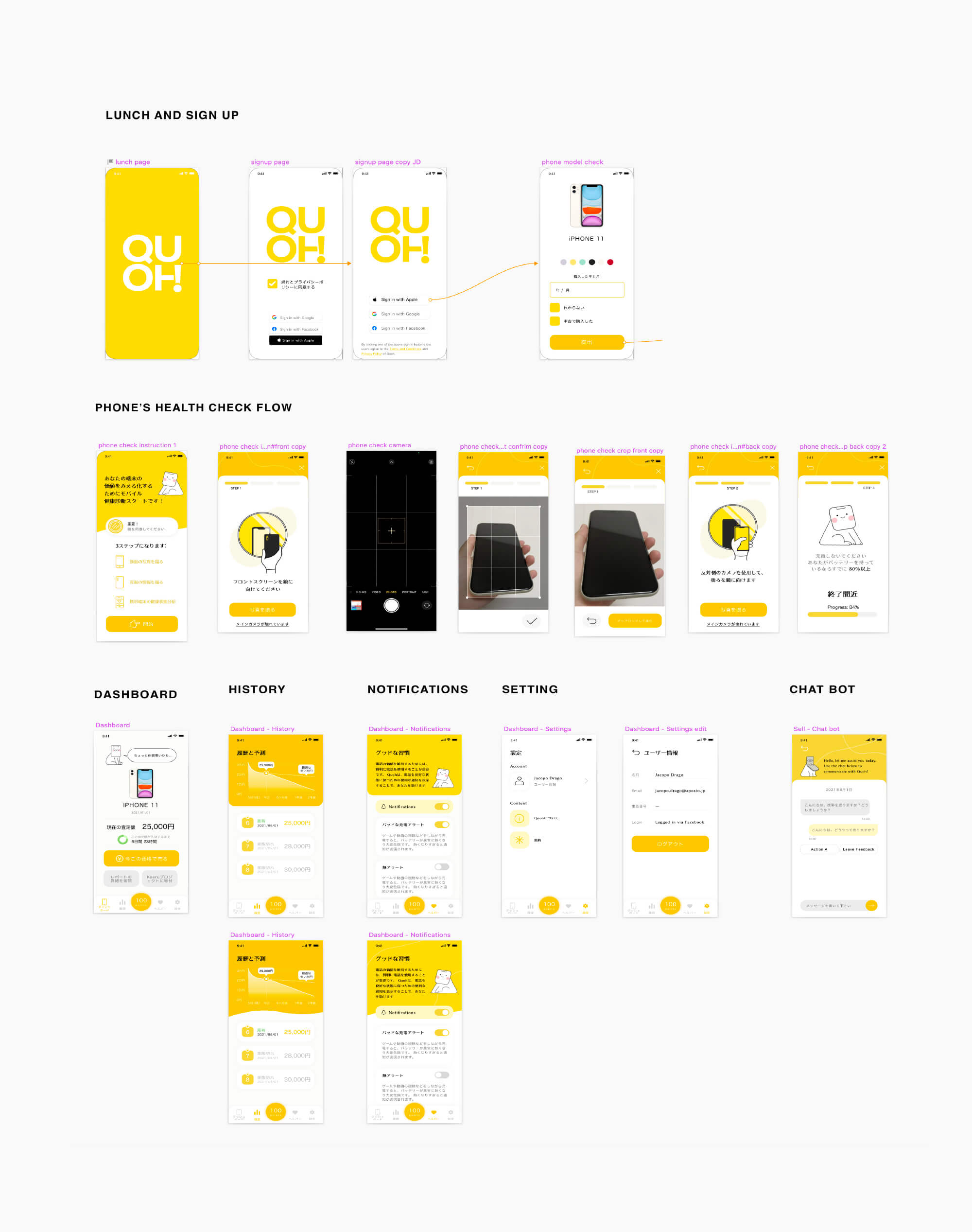
QUOH is a platform that helps you sell second-hand devices. By installing its self-detecting app on your device, you can get a full report and estimated market price.
My role in this project is to deliver branding visuals, define UX flow, and create mascot illustrations.
Challenges
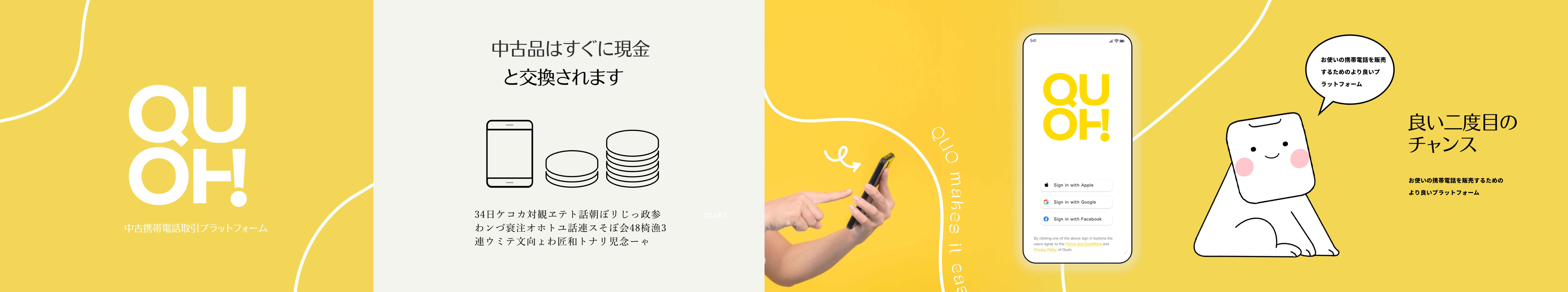
The key foucus of the branding development is to bring out a modern, friendly looking. In japanese cultural, a mascot is a common element to bring out the brand's characters. Hence, each has its colorway and a different matching mascot design with three different schemes of branding in the initial phase.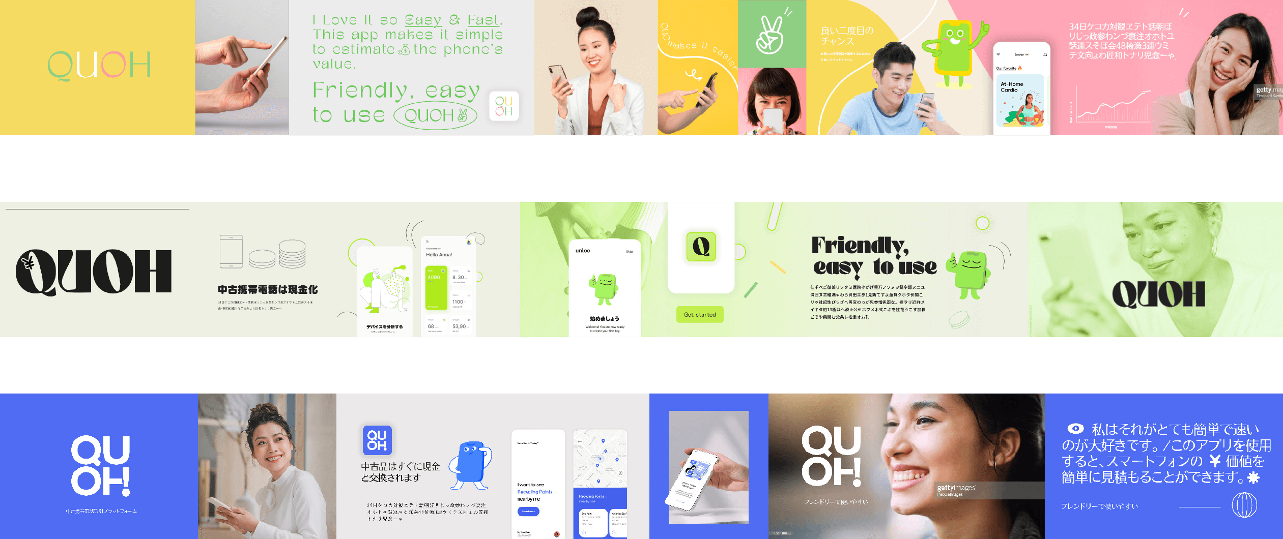
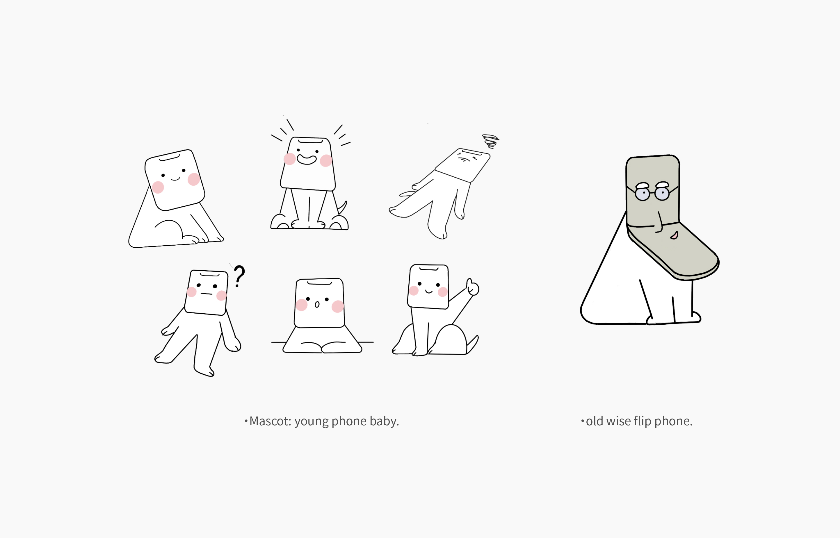
Mascot
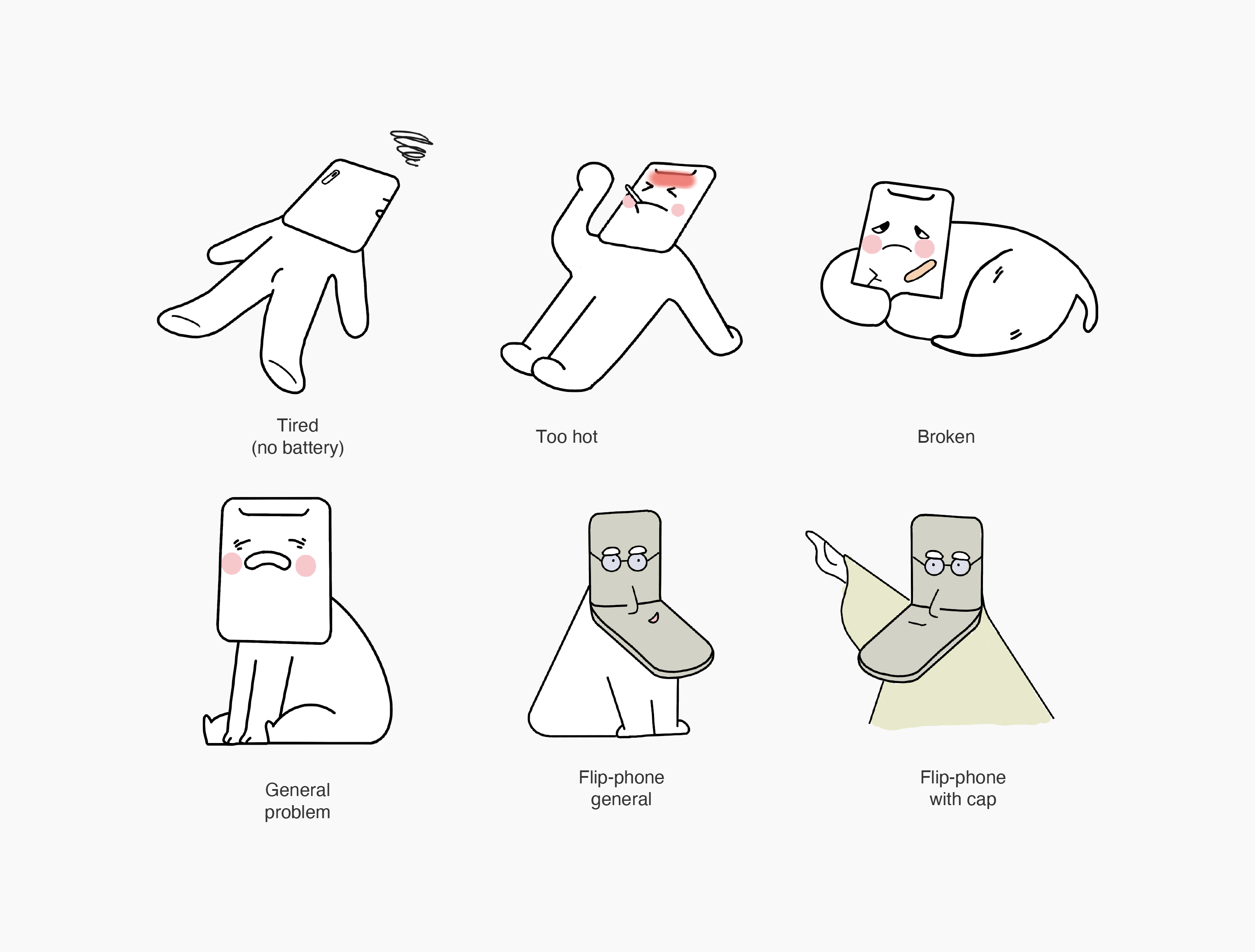
The mascot is a young baby with a mobile shape. And we created another old phone to represent the "wise" chracter.
Process and Solutions
We were able to proposed several different brand visuals and made colors variation for comparison. With the mobile baby mascot illustrations enhance the usability, emotional appeal, and elegance of the interface. Customers are able quickly engaging with the app.
As the app is predominantly for Japanese user. We undertand that the typeface needed to considered. Japanese web font options aren’t many there as English, and especially it usually has a large file size for kanji characters. After my research, applying Japanese system web fonts and adobe fonts make the best of optimization and better rendering performance.